[chatbot]
prototype-test-analysis

Ready to analyse the results of your prototype test? Excellent!

Here’s your step-by-step guide on how to collect the test data, analyse the results, and interpret the findings. Just remember, the method may differ depending on whether you’ve created a task flow prototype test or a free flow prototype test — so make sure you’re following the right steps for each one. 

Step 1: open the test results you want to analyse

From your personal dashboard, click on the settings menu of the test you want to analyse. 

  • Select ‘View results’.
Analyse test, View results

Step 2: review the general results information

Each prototype test that you carry out comes with its own individual dashboard…

Analyse test, Test overview

a. Review the test overview

Under the ‘Overview’ tab, you’ll find a general summary of your test results, including information such as:

  • the total number of participants 
  • the total number of participants from UserQ/shared link
  • test details (number of introduction questions, conclusion questions, and tasks)
  • average engagement time per test
  • Total number of prototype tasks
  • skip rate (only for task flow)
  • completion rate (only for task flow)
  • average time spent on the tasks.

b. Examine participant data

Now’s the time to find more in-depth information on who took part in your test under the ‘Participants’ tab, including: 

  • gender
  • age
  • nationality and residency
  • current employment status (and industry, department)
  • household status and income
  • and more.

If you’ve used a shared link only, remember this section will be empty because you used your own participant pool, not ours. 

Analyse test, Participant demographics

Step 3a: review the prototype results (for task flow)

Skip to the free flow method below if you created a free flow test instead of a task flow test.

The main test results can be found under the ‘Prototype test’ tab. The data is presented according to each specific task that participants completed. 

a) Overview

Prototype test_task overview

The findings of each task has an overview section including the following information:

  • completion rate (the number of participants who ended correctly on the goal screen)
  • skip rate (the number of participants who abandoned the task and didn’t complete it)
  • average time spent (on the task across the entire participant pool)
  • average clicks (participants took while performing the task).

b) Common paths

Prototype test_task flow_common paths

Discover the most common series of pathways performed by the majority of participants.

You won’t see every pathway taken (pathways taken by just one user are not shown), just the pathways that multiple participants performed. Under each pathway, you’ll see the following information: 

  • whether it was a failed pathway or a successful pathway (correct or incorrect goal screen reached)
  • title of the pages reached across the pathway
  • number of participants who took the common pathway
  • title of the pages reached across the pathway
  • average time spent performing the pathway.

The goal screen of the successful paths is highlighted in green. You can also see the average time spent on each single page explored in the flow.

c) Behaviour

The behaviour data is the most important set of findings for your prototype test. This shows how participants behaved on the prototype, including where they clicked and where their focus tended to be during the navigation. 

Image
Prototype task flow_image view

Under the behaviour section, you can view the image screens you used in the test, ie. your website page design, etc. 

  • Change how you see the image by selecting the desired setting from the ‘Select size’ drop-down menu. Choose from ‘Fit to width’, ‘Actual size’, or ‘Fit to canvas’. 
  • Select the screen image you want to view from the ‘Select screen’ drop-down menu.
Heatmap

Once you’ve selected how you want to view the image, you can then look at the heatmap findings by clicking ‘Heatmap’. With this data, you’ll be able to see what participants do on your prototype – ie. where they click, where they scroll to, and what areas and elements they most engage with. 

Prototype test_heatmap

The focus areas are shown through red markings – the deeper the red, the more participants focused their attention there.

Tip: you can download the heatmap and clickmaps. Save the map to your personal drive for future use.

Clickmap

The clickmap visualises the data in a similar way, this time in the form of dots which provide a clearer vision and the exact coordinates of the click, whereas the heatmap is more about showing the most active areas.

Prototype test_clcikmap

Tip: you can also view the average time spent to perform the total of clicks on each page. You’ll find this information at the bottom of the screen image.

d) Follow-up question

Answers to the task flow follow-up question are at the bottom of the results page. Depending on the type of question asked (free text, likert scale, etc.).

Prototype task flow_follow up question

Remember, you can see all of the above data for each individual task. So be sure to review the data for each one using the left and right arrow buttons at the top of the ‘Prototype test’ page.

Step 3b: review the prototype results (for free flow)

Follow the below steps if you created a free flow test (when you ask participants to freely explore your prototype based on the instructions you provide).

a) Overview

The overview of the free flow prototype test findings include the following information:

  • average time spent exploring (across the entire participant pool)
  • average clicks taken while exploring.
PROTOTYPE Free flow_overview

b) Common paths

See what common pathways were taken per flow. No single-user paths are shown, just common pathways that multiple participants explored. Under each common pathway, you’ll see the following information: 

  • what individual screens/pages were explored
  • the average time spent performing the pathway
  • the number of participants who took the common pathway.

Unlike the task flow pathways, there will be no green screen to highlight whether participants reached the goal because the results show a free exploration, not a specific goal-reaching task.

Prototype free flow_common paths

c) Behaviour

The behaviour data works in the same way for free flow and task flow. You are shown how participants behaved during the test, including where they clicked and where their focus tended to be during the test. 

Image

Under the behaviour section, you can view the image screens you used in the test, ie. your website page design, etc. 

  • Change how you see the image by selecting the desired setting from the ‘Select size’ drop-down menu. Choose from ‘Fit to width’, ‘Actual size’, or ‘Fit to canvas’. 
  • Select the screen image you want to view from the ‘Select screen’ drop-down menu.
Heatmap

Once you’ve selected how you want to view the image, you can then look at the heatmap findings by clicking ‘Heatmap’. With this data, you’ll be able to see what participants do on your prototype – ie. where they click, where they scroll to, and what areas and elements they most engage with. 

The focus areas are shown through red markings – the deeper the red, the more participants focused their attention there.

Clickmap

The clickmap visualises the data in a similar way, this time in the form of dots which provide a clearer vision and the exact coordinates of the click, whereas the heatmap is more about showing the most active areas.

d) Questions

Prototype free flow_questions

Unlike task flow where you can ask just one follow-up question per task, free flow allows you to ask up to three questions for each task. Answers to the free flow questions are at the bottom of the results page. 

You can also view the answers by user, chart, and aggregated data.

For more information on how to analyse answers to questions, check out our survey guide. You’ll find everything you need to know on there. 

Lastly, take a look at the answers for your pre-test introduction questions and post-test conclusion questions. 

This is your chance to read through the responses and notice any patterns and similar responses. For example, if the majority of participants answered that they think the colour palette of Design 1 is too dark or dull, chances are they’re right. However, it’s completely up to you whether you take their feedback on board and make amendments. 

Step 4. examine introduction/conclusion questions

Next, it’s time to review the answers for your pre-test introduction questions and post-test conclusion questions (if you’ve added any).

Step 5. summarise your findings

Once you’ve reviewed the prototype test data, you’ll naturally start to form your own conclusions based on the ways participants behaved, how they interacted with the prototype, and the opinions they formed about it.

Amongst the conclusions, you might identify certain strengths that solidify the success of some elements – but also useability pain points that need rectifying or adjusting moving forward. For example, you might find that:

  • certain pages are hard to find
  • design elements are misleading or distracting
  • buttons are in the wrong place
  • information is categorised illogically
  • pages names and titles are confusing.

With insights gained from the data, you can solve usability issues and turn the feedback into actionable ways of improving the prototype to create a better user experience — all based on the participant experiences. 

That’s why we recommend conducting multiple prototype tests – with each one improving on the last until your results show exactly what you desire from your prototype. 

Build your prototype test today

Ready to build your prototype test? 


Start by joining the UserQ platform as a researcher and you can be testing in minutes. 

Get started for free today. 

Need a hand with building your test? No problem. Feel free to send us a message to: support@userq.com. We’re always ready to answer any questions or queries you have.

Related Post

Tree Test How to Guide

Tree testing guide: How to

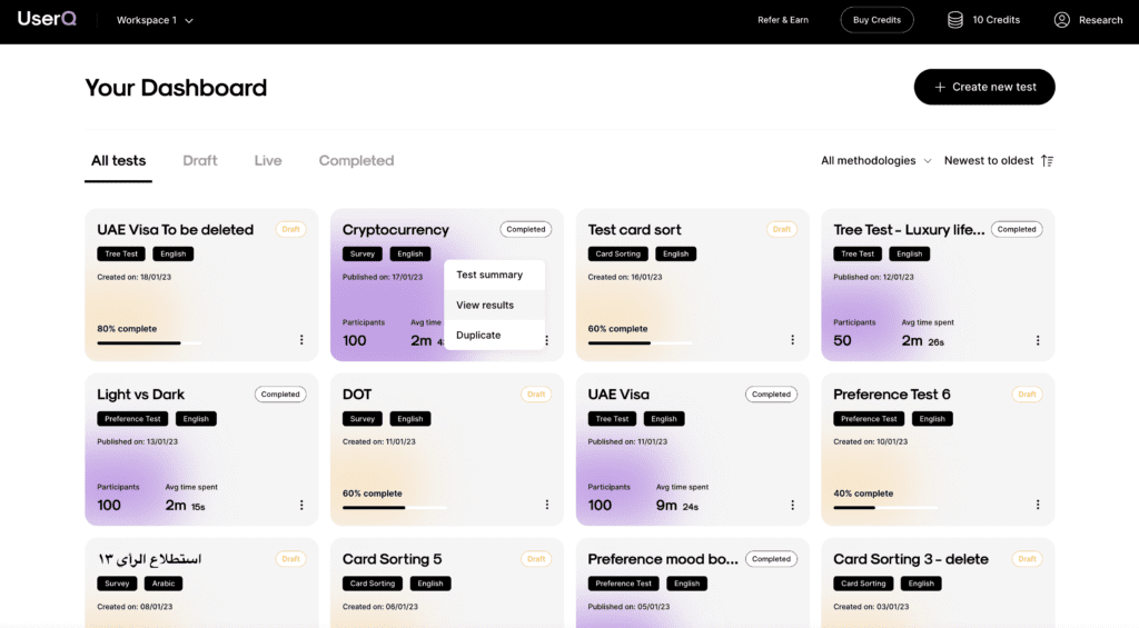
Want to build a fully functional tree test the easy

Tree testing analysis

Tree testing guide: Analyse tree

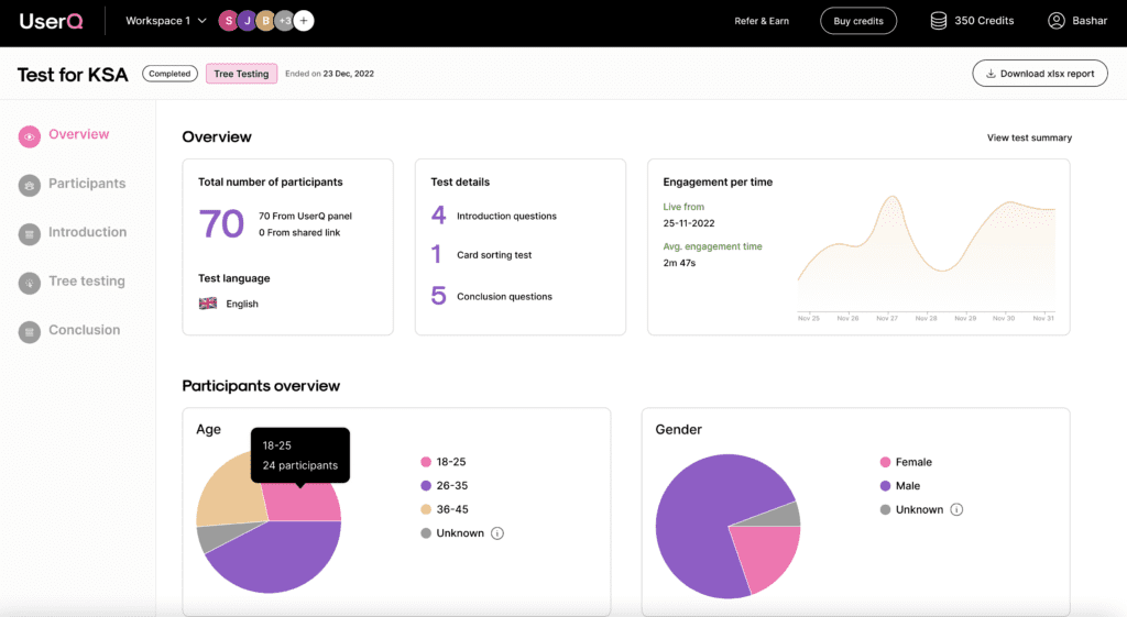
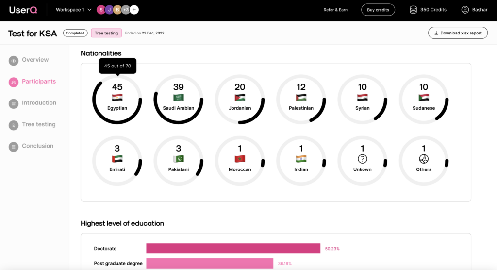
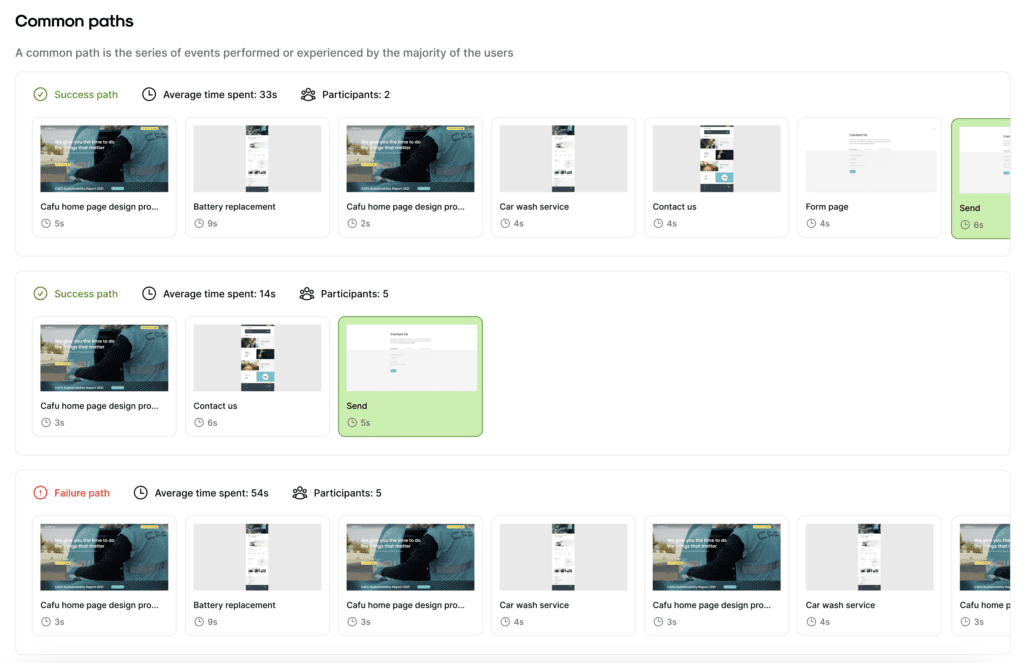
You’ll have access to the results as soon as the

card sorting how to guide

Card sorting guide: How to

Want to build simple and easy-to-use card sorting tests? You

Leave a Comment

Subscribe to our newsletter

Receive emails about UserQ updates, new features, offers and latest trends.

    UserQ-logo-white-large

    Say goodbye to assumptions in product research and get real feedback from local users in MENA, fast.

    UserQ - Pay as you go user testing platform in MENA | Product Hunt

    Copyright © 2024 UserQ – A Digital of Things company