🎁 Free 30-day publishing fees on Pay-As-You-GO. Get 15% off when recruiting from the UserQ Panel, with code HELLO15

Here at UserQ, we’re known for our expertise in conducting user research tests, and we’ve recently conducted a set of tree tests to compare the navigation and functionality of two bank websites: HSBC (AE) and Emirates NBD.
Ultimately, the results were fascinating. So we’ve decided to let you in on what we found. Here’s everything you need to know about the entire journey – starting from the project objective to the results we obtained.
Project background and scope
HSBC (AE) and Emirates NBD are both major banks found here in the UAE. Out of curiosity, we wanted to test which bank had better navigation menus for customers looking to carry out personal banking.
To do this, we decided on two separate tree tests using our own UserQ tree test tool: one for HSBC, and another for Emirates NBD. The very nature of a tree test tells you how easy it is for users to navigate a site and helps you answer key questions about a website’s functionality and information architecture such as:
- Is the content grouped together in a logical, straightforward way?
- How quickly and easily can information be found?
- What might be preventing users from finding the content they’re looking for?
To find out how easy (or difficult) it was to find certain information on the banks’ websites, the tree test involved setting participants certain tasks, such as finding a particular product or asking them to get to a certain page.
This type of testing helped identify pain points that the users encountered, plus which bank offered the more user-friendly and streamlined online customer journey.
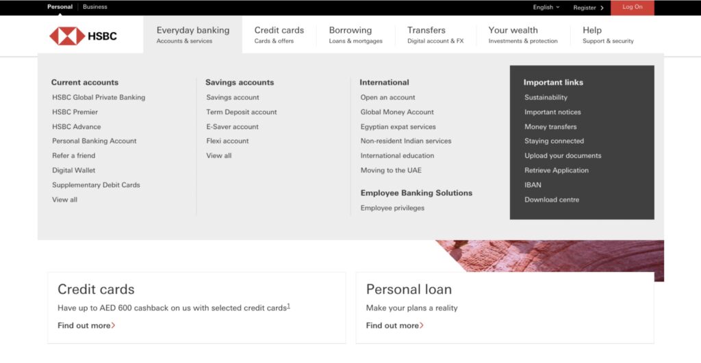
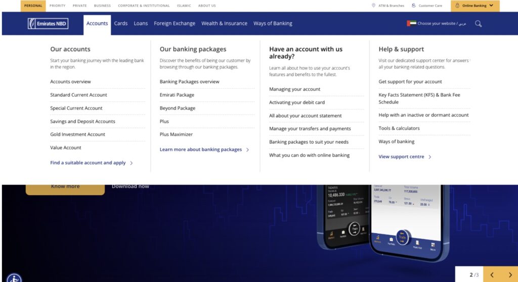
To provide you with an overview of the layout of each bank’s website, we’ve showed what their navigation menus look like below, consisting of category tabs (eg. ‘Accounts’, ‘Credit Cards’ ‘Transfers’, ‘Loans’ etc.) and additional menus with subtitles under each tab:
Questions and findings
So, what questions did we ask participants? What navigation tasks did we set for them?
Given that both banks offer practically identical services, we were mostly able to ask the same questions across both individual tests in order to easily compare the two – bar slightly altered verbiage according to what each bank labelled certain services. For example, HSBC referenced ‘International money transfers’, while Emirates NBC went with ‘Western Union money transfers’.
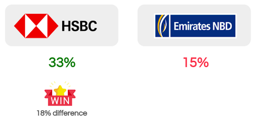
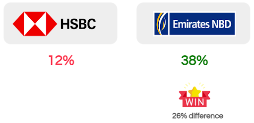
We asked a total of eight questions. Below you’ll find what tasks we set, the total success rate for each question, and which bank came up trumps.
Question 1
“If you just purchased a new car and wanted to find more information about car insurance, where would you look?”
Question 2
“If you needed more information on mobile banking, where would you look?”
Question 3
“If you wanted to open a new personal banking account, where would you look?”
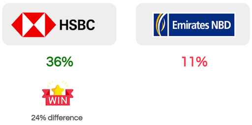
Question 4
HSBC: “If you wanted to read more information on Air Miles credit card benefits, where would you find it?”
Emirates NBD: “If you wanted to read more information on credit card benefits & rewards, where would you find it?”
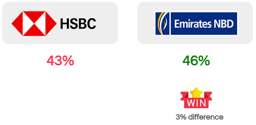
Question 5
“If you wanted to read more information on financial planning for the future, where would you find it?”
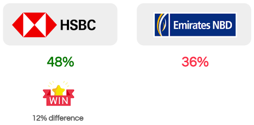
Question 6
“If you are in a new city and wanted to find nearby ATMs for your bank, where would you find it?”
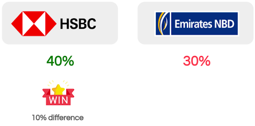
Question 7
HSBC: “If you needed to send money abroad, where would you find more information on international money transfers?”
Emirates NBD: “If you needed to send money abroad, where would you find more information on Western Union money transfers?”
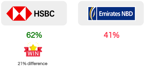
Question 8
“Imagine you are switching banks and would like to transfer your credit card debt from your old bank to your new bank. Where would you find more information on balance transfer?”
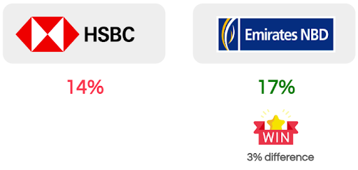
Grand Total
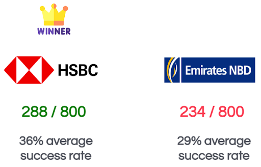
Drum roll, please. The winner was….
How do they differ?
With HSBC as the winner with the easier-to-navigate website menu, we then drew a conclusion of why that might’ve been using three key reasons…
1. Inclusion of subtitles
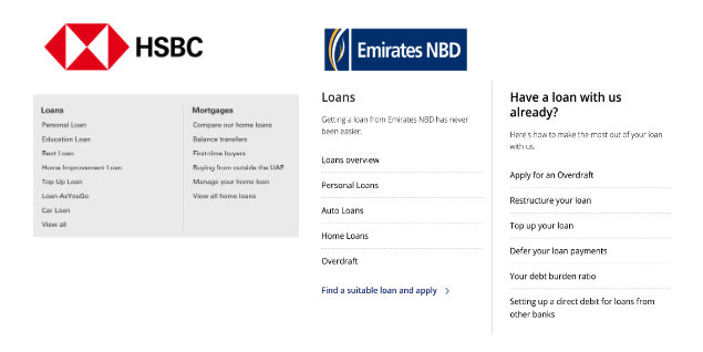
As you can see from the comparison images below, HSBC included subtitles under each category title in their navigation menus – helping users better predict where to find certain items.
2. Easy-to-understand navigational elements
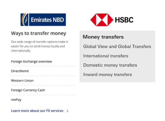
The language used in the labels and titles also made certain items easier to find and identify. For example, as you can see below, for ‘money transfers’, HSBC has clear information with universal terminologies used in everyday customer language, whereas Emirates NBD uses a list of trademark names which may not be immediately recognisable to the average consumer.
3. Tailored to region
HSBC also provides labels which are tailored to the region, e.g. ‘Buying from outside the UAE’, which is a common service here, with people outside of the country investing in UAE property.
Plus, they have several options tailored to their users, e.g. ‘Compare our home loans’, ‘Rent loan’, and ‘First-time buyers’. This indicates that HSBC carried out research on what their users frequently search for and so provided quick links for these popular services.
Users vs. non-users
Interestingly, an average of 38% of participants were Emirates NBD users for both tests, while only an average of 6% were HSBC users.
This shows that despite the clear majority of participants not being regularly exposed to HSBC and its website, many were still able to figure out its navigation in comparison to that of Emirates NBD.
Want to carry out your own tree test?
Sign up as a researcher and create your account for free, with no monthly commitments.
For more explanation of what a tree test involves and how you can carry out a tree test using our platform, be sure to take a look at our full guides:Tree testing guide: How to create a tree test and Tree testing guide: Analyse tree test results. With these step-by-step tutorials, you’ll have everything you need to know about creating and analysing a tree test like a pro.
Related Post

Best practices for conducting remote
In this guide, we’ll let you in on UserQ’s top tips and tricks to utilise our selection of remote user

Start, Grow, Lead: A Guide
A career in which you can make a real difference to the everyday lives of customers and clients alike is

Validating your prototype FAQs: advice,
Ready to validate your prototype with our easy-to-use prototype testing tool? Well, we’ve got some must-hear advice and support to
Subscribe to our
product newsletter!
Receive emails about UserQ updates, new features,
offers and latest trends.


