🎁 Free 30-day publishing fees on Pay-As-You-GO. Get 15% off when recruiting from the UserQ Panel, with code HELLO15
We’ll cover everything in this UserQ tutorial…from how to collect the test data, analyse the results, and interpret the findings.
Step 1: open the test results you want to analyse
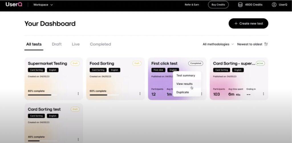
From your personal dashboard, click on the settings menu of the test you want to analyse.
- Select ‘View results’.
Step 2: review the overview data
Each first click test that you create has its own individual dashboard…
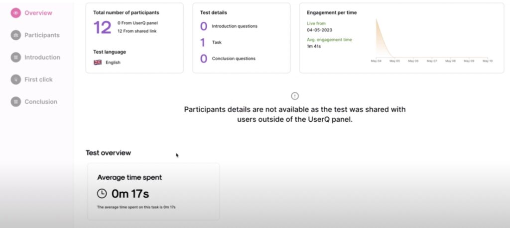
Under the ‘Overview’ tab you’ll find a general summary of your test results, including information like:
- the total number of participants
- the total number of participants from UserQ/shared link
- test details (number of introduction questions, conclusion questions, and tasks)
- participant overview (age, gender, and other demographics)
- average engagement time.
- average time spent.
Step 3. review the first click analysis data
You can view the first click data by either clicking the ‘First click analysis’ button at the bottom of the overview page or by selecting the ‘First click’ tab on the right-hand side menu.
The first click data is presented according to each specific task that participants completed.
The behaviour data shows how participants behaved during the test, including where they clicked and where their focus tended to be during the test.
Image
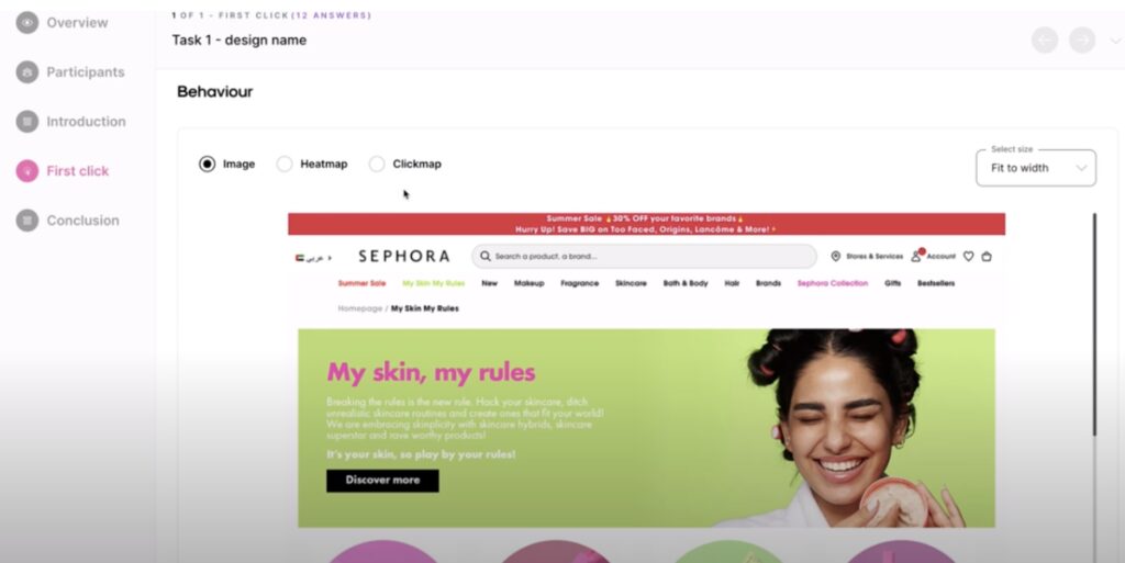
To start, you can view the image screens used in the test, ie. your website page design or screenshot, etc.
- Switch how you see the image by selecting the desired setting from the ‘Select size’ drop-down menu. Choose from ‘Fit to width’, ‘Actual size’, or ‘Fit to canvas’.
- Select the screen image you want to view from the ‘Select screen’ drop-down menu.
Heatmap
Once you’ve selected how you want to view the image, you can then look at the heatmap findings by clicking ‘Heatmap’. With this data, you’ll be able to see where participants focused on the image, ie. what areas and elements they are most engaged with.
The high engagement areas are shown through red markings. The deeper the red, the more participants focused their attention there.
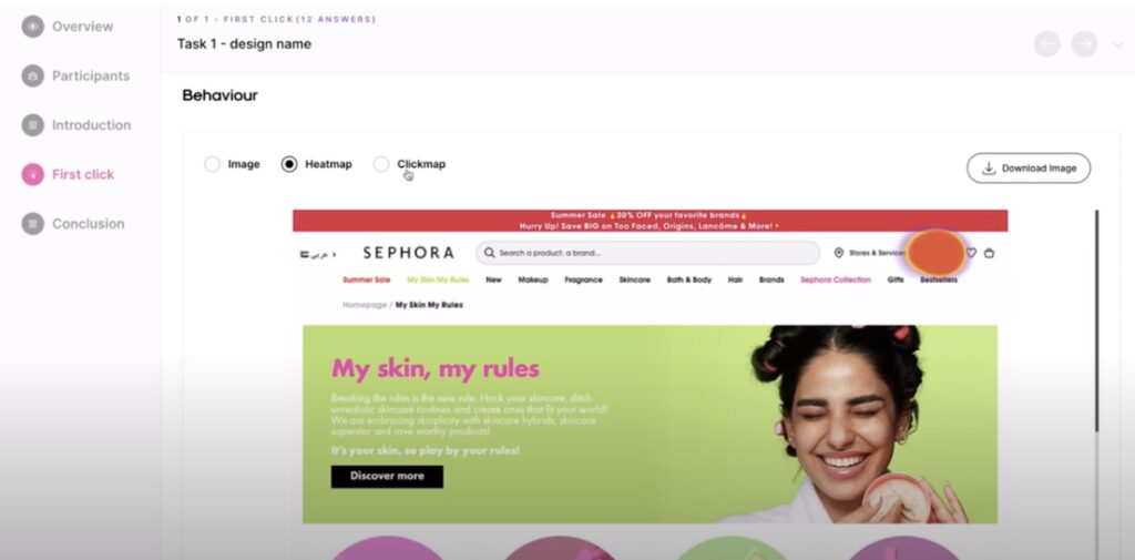
Tip: make sure you download the maps to save them. That way you can refer back to the findings for future reference.
Clickmap
Next you can look at the clickmap by selecting the ‘Clickmap’ tab. The data is visualised in a similar way, except the dots provide a clearer vision and the exact coordinates of the click, whereas the heatmap is more about showing the most active areas.
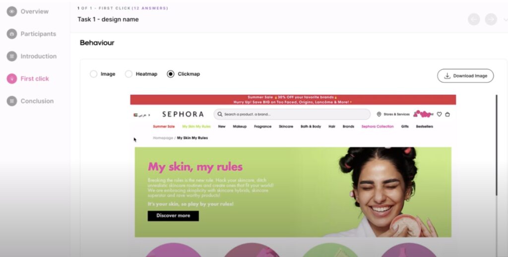
Tip: you can also view the average time spent to perform the total of clicks on each page. You’ll find this information at the bottom of the screen image.
Once you’ve viewed the information for the first task, move on to the next by using the left and right arrow buttons at the top of the ‘First click test’ page.
Step 4. review the answers to the follow-up questions
Answers to the task flow follow-up questions are at the bottom of the first click analysis page. Depending on the type of question asked (free text, likert scale, etc.), the results are presented with the following information:
- individual participant number
- their answer
- time spent answering the question
- date completed
Step 5. examine introduction/conclusion questions
After reviewing the data for your first click test, next you can check out the answers for your pre-test introduction questions and post-test conclusion questions (but only if you created any — they’re optional).
You’ll find them under the ‘Introduction’ and ‘Conclusion’ tabs on the right-hand side menu.
Step 6. summarise your findings
After you’ve finished reviewing the first click data, natural conclusions will start to arise based on results across the tasks and the answers to the follow-up questions.
It’s down to you as the researcher to look at the bigger picture of how the participants interacted with your images and what interface areas/elements they clicked on most, including menus, buttons, icons, labels, etc.
With the map visualisations of clicks and high-engagement areas, you can also identify and highlight certain parts that might be confusing or misleading – plus what’s user-friendly and works well on the interface. It’s also super handy to look at the average click time per task to see how easily certain buttons or menu labels were found. The quicker the time, the easier it was to find – and the better the usability of your design.
With such valuable insights and feedback, you can progress your designs by turning the data into actionable changes and improvements based on user experiences. We recommend running multiple first click tests, especially with any new designs or elements to verify their usability.
Essentially, if users are clicking in the right place, with good accuracy and high speed, then you know your design is user-friendly.
Build your prototype test today
Start building your prototype test today by joining the UserQ platform as a researcher.
Need some assistance or support whilst building your prototype test? If so, send us a message to: support@userq.com. We’re ready to answer any kind of questions or queries you might have.
Related Post
Tree testing guide: How to
Want to build a fully functional tree test the easy way? Here at UserQ, we’ve got the tools you need
Tree testing guide: Analyse tree
You’ll have access to the results as soon as the tree test is published. The findings of your test show

Card sorting guide: How to
Want to build simple and easy-to-use card sorting tests? You can with UserQ. Our pay-as-you-go user testing platform allows you
Subscribe to our
product newsletter!
Receive emails about UserQ updates, new features,
offers and latest trends.


