


Related Post
04
Apr

The benefits of user research
User research is typically a key part of product development and business growth all around the world, but here at
03
Oct
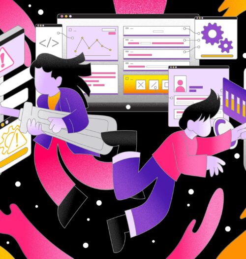
10 Warning signs of a
User experience (UX) design is critical in shaping the end-user’s interaction with digital solutions. As it plays a vital role
03
Oct
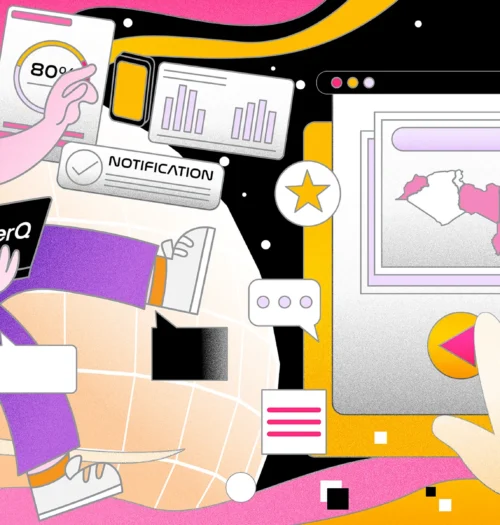
Potential of AI in UX
With companies prioritising user-centric design to satisfy customer expectations, the Middle East and North Africa (MENA) area is a fast
