🎁 Free 30-day publishing fees on Pay-As-You-GO. Get 15% off when recruiting from the UserQ Panel, with code HELLO15

Understanding your users on a deeper level is no longer a luxury in design and has now become a necessity. One of the simplest yet most effective tools for this is empathy mapping. If you’ve ever felt like you’re designing for assumptions rather than real people, then this tool might just change how you work.
We’re going to break down what empathy mapping in UX really means, when you should use it, and how to actually do it in a way that leads to better design and, ultimately, happier users.
What is empathy mapping?
Empathy mapping is a visual tool used in UX and service design to help teams better understand and communicate what users are thinking, feeling, saying, and doing. It’s about collecting insights from real users and turning that data into something tangible and human. To ensure these insights are accurate, UX teams often combine empathy mapping with research methods like behavioural and attitudinal studies, which reveal not just what users say but also what they do.
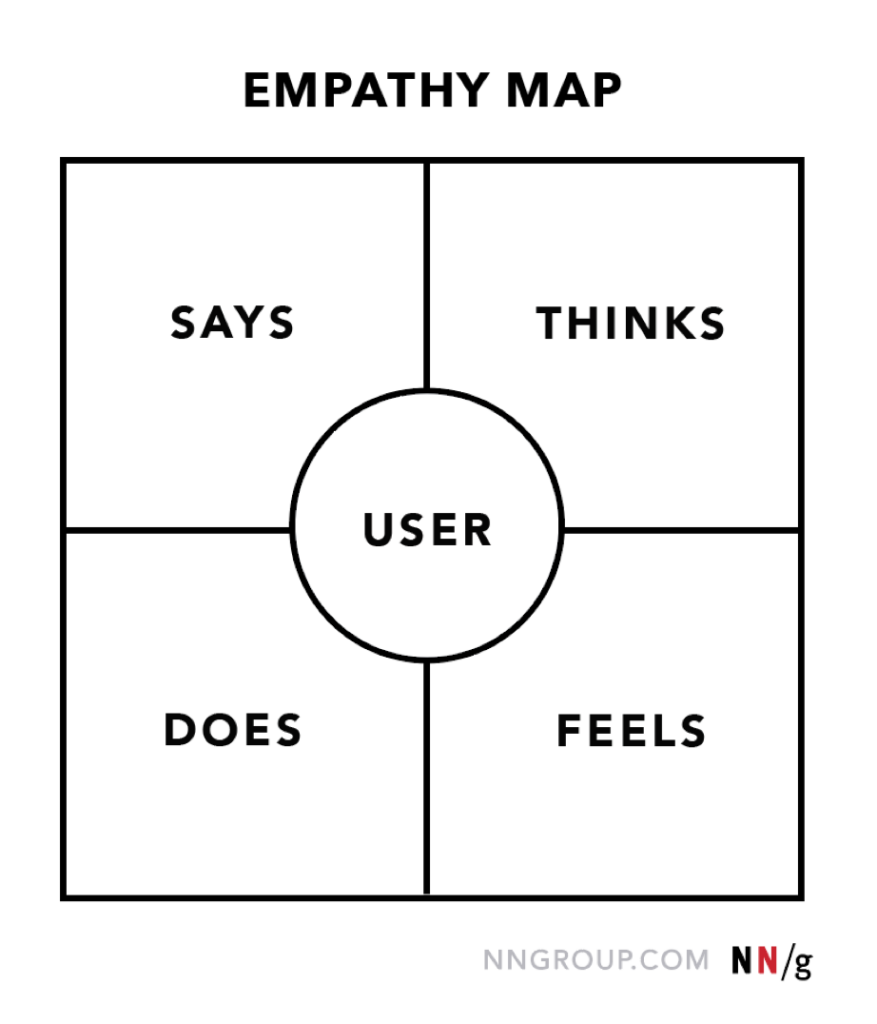
A standard empathy map in UX design includes four quadrants:
- Says – What the user says out loud in interviews or testing
- Thinks – What they’re thinking but might not say
- Does – The actions they take
- Feels – Their emotional state during the experience
At the centre is the user or persona you’re focusing on. This structure helps you go beyond demographics and start thinking about the human behind the clicks.

Empathy map canvas from nngroup.
Why does empathy mapping matter?
We’ve all heard that user-centred design is important. But there’s a difference between saying it and actually designing around it. That’s where empathy mapping comes in.
Here’s the reality: people don’t use products in a vacuum. They come with emotions, expectations, biases, and frustrations. If we don’t understand these, we risk building something technically brilliant that nobody relates to. That’s why crafting a clear user-centered design statement is so crucial – it keeps teams aligned on who they’re designing for and why it matters.
Recent research shows that 88% of online consumers are less likely to return to a site after a bad user experience. Poor UX often comes from not fully understanding what users need emotionally and functionally. Empathy mapping in UX helps fill in those gaps by grounding your design in real human insight.
It’s not just about better usability, it’s about emotional resonance. When users feel seen, they stick around.
When to use empathy mapping
You don’t need to be deep into a project to benefit from empathy mapping. In fact, the earlier you start, the better.
Here are key moments to bring it in:
- Before defining product requirements: Use an empathy map to align the team around user needs and pain points.
- During persona development: It adds depth to your personas, making them more than just age and job titles.
- When pivoting or redesigning: If something’s not working and you don’t know why, go back to empathy mapping to re-centre your user understanding.
- Post-research synthesis: After interviews or observations, use a map to organise insights.
The point is: don’t wait until you’re stuck. Start mapping early and update often.
How to create an empathy map
If you’re wondering how to create an empathy map, here’s a step-by-step approach that actually works:
1. Pick a specific user or personas
Start by selecting one user segment or personas that represents a key audience for your product. Don’t generalise. This should be someone you’ve spoken to or observed, not an abstract idea of a user. If you’ve not run user interviews or usability studies yet, do that first.
2. Gather data
Real empathy starts with real evidence. Collect qualitative data from user interviews, customer support logs, usability testing, field research—any situation where you’re hearing directly from the user. Focus on their words, actions, and emotional responses. Avoid projecting your own assumptions.
3. Draw the map
Use a physical whiteboard, sticky notes, or digital tools like Miro, FigJam, or Lucidchart. Divide the map into four quadrants labelled: Says, Thinks, Does, Feels. Place your user or persona at the centre. Keep it simple, clear, and accessible to the team.
4. Fill in the quadrants
Populate each section using the data you’ve collected. Use direct quotes for the ‘Says’ section. For ‘Thinks’ and ‘Feels’, you may need to infer, but always base those on evidence. Be specific. Instead of saying “user is stressed,” write something like “panics when she forgets her password because it locks her out for 30 minutes.”
5. Identify insights
Look across quadrants for interesting contrasts. Is the user saying they’re fine but their actions suggest confusion? Are their emotions at odds with their behaviours? These contradictions can highlight unmet needs or usability issues that might otherwise be missed.
6. Share and discuss
Once your empathy map in UX design is complete, share it with your wider team—designers, developers, marketers, and product managers. It should be a conversation starter, not just an artefact. Use it to challenge assumptions, guide product decisions, and prioritise improvements. A well-used map will actually shift thinking and inspire action, not just gather dust in a digital folder.
Common mistakes to avoid
Even though empathy mapping is simple, there are a few traps people often fall into:
1. Skipping real user research
If your map is based on assumptions, it’s not an empathy map, it’s a wish list.
2. Being too generic
Writing things like “wants a good experience” or “frustrated” without detail doesn’t help anyone. Be specific and evidence-based.
3. Not updating the map
Your users change. Your understanding of them should too. Update your empathy maps regularly as you gather new data.
4. Treating it as a checkbox
This tool only works if it leads to action. If it’s just done once and never looked at again, you’re missing the point.
Empathy mapping in practice
Let’s say you’re redesigning a mobile banking app. You conduct 10 interviews and start to notice themes. Users feel anxious about security, annoyed by too many steps, and often say things like “I just want to check my balance quickly.”
You create an empathy map for your primary persona: a busy parent who uses the app during short breaks. In the “Thinks” quadrant, you add: “Hope this is quick, I’ve got 2 minutes before the kids get home.” In “Feels”: “stressed about making mistakes.”
Now your team knows this user doesn’t just want features, they want simplicity, speed, and reassurance. That insight changes your design choices.
That’s how empathy mapping in UX moves from theory to action.
Empathy mapping vs. other UX tools
You may wonder how this approach compares to other UX methods, such as user personas, journey maps, or user stories.
Here’s how empathy mapping stands out:
- Empathy map vs. persona – Personas describe who your user is. An empathy map explains how they feel and behave in context.
- Empathy map vs. journey map – Journey maps show the steps users take. Empathy maps reveal their internal experience during those steps.
- Empathy map vs. user stories – User stories help build features. Empathy maps help decide which features are worth building.
UX tool | Focus area | What It tells you | How empathy mapping adds value |
User persona | Demographics, goals, behaviours | Who your user is: their age, role, goals, habits | Brings in emotions, thoughts, and context |
User journey map | Sequence of interactions over time | What steps the user takes to complete a task | Reveals internal experience during those steps |
User story | Product functionality and feature need | What feature to build, e.g., “As a user, I want to…” | Shows why that feature matters emotionally |
Empathy map | Emotions, thoughts, behaviours in context | How the user feels, thinks, and acts in a situation | Deepens all the above with human-centred insight |
It’s not about choosing one, it’s about layering them. Start with empathy mapping, and let it inform the rest.
The future of empathy mapping in UX
With the rise of AI, personalisation, and increasingly complex digital ecosystems, understanding user emotion and motivation is becoming even more critical.
Empathy mapping in UX is evolving, too. Teams are using video highlights, live mapping during research, and integrating emotional analytics to deepen insight. It’s no longer a sticky-note activity. It’s a strategic tool that’s earning a place in executive decisions.
More companies are waking up to the fact that good UX is about empathy as much as efficiency. And that’s a good thing.
Conclusion
At its core, empathy mapping isn’t just a design activity; it’s a mindset shift. It helps teams stop guessing and start understanding. It grounds strategy in emotion and gives structure to insight.
If you’re looking to build products people actually care about, don’t skip this step. Whether you’re just starting out or refining an existing design, take time to create an empathy map. Revisit it. Challenge it. Let it guide your work.
And remember, great design starts with listening.
Related Post

The benefits of user research
User research is typically a key part of product development and business growth all around the world, but here at

10 Warning signs of a
User experience (UX) design is critical in shaping the end-user’s interaction with digital solutions. As it plays a vital role

Potential of AI in UX
With companies prioritising user-centric design to satisfy customer expectations, the Middle East and North Africa (MENA) area is a fast
Subscribe to our
product newsletter!
Receive emails about UserQ updates, new features,
offers and latest trends.


