🎁 Free 30-day publishing fees on Pay-As-You-GO. Get 15% off when recruiting from the UserQ Panel, with code HELLO15
As UX designers, we pour our hearts and souls into crafting intuitive user experiences. But this is not always an easy task to do, especially if our users struggle to navigate through the designs.
Imagine a user trying to find a specific piece of information on your website or app, only to find the navigation quite difficult, leading to a poor user experience. That’s why having a clear and well-organized menu is important to guide users in completing their user journey.
In this article, we will guide you through the fundamentals of designing a menu, their add-on value in a design, and 10 menu design guidelines that you should start following right now.
What is a menu in UX design?
Before we proceed, let’s first define what a menu is. You must have come across this term as a UX designer, or if you’re starting your journey in the field of UX.
A menu is a navigational design element that provides users with a structured overview of the information and functionalities available within a website or application.
Common types of menu designs
Here’s a list of the most common menu designs you will find over the internet.
1. Bento menu
Bento design grids have been trending recently and will continue to do so in 2025 as well. The term “Bento” comes from Japanese which represents a Japanese-style single-portion take-out or home-packed mealbox. Every item in the box is organised in grids, and the concept of bento in designs arose from here.
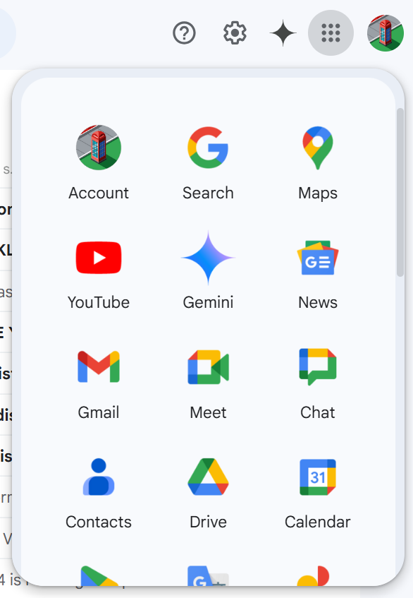
It provides different navigational options within a grid. The most common application of this can be seen on Gmail. Have you ever noticed that icon grid in the top-right corner of your Gmail? Yep, that’s a bento menu!
2. Kebab menu
You might wonder why we have been talking about food since point one. But as you know, UX takes inspiration from real-world designs, and the kebab menu is another example of it. It is the most common type of menu on mobile touchpoints and is often depicted by three dots in the corner to open the navigation.

3. Burger menu
It is yet another common type of menu that we usually find on apps. It is represented with three horizontal lines. The icon was designed by Norm Cox in 1981 for the Xerox Star workstation’s graphical user interface.

4. Multilevel menu
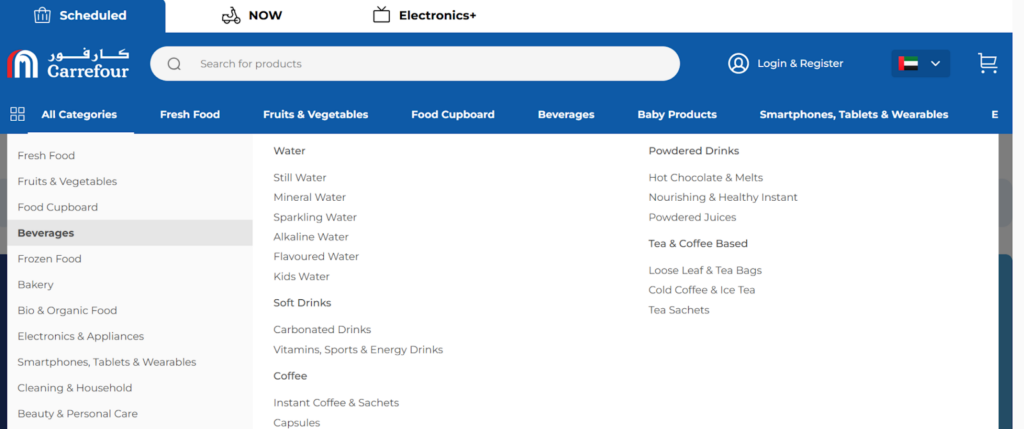
A multilevel menu is commonly seen on websites with a complex information architecture, helping users easily navigate the content of the website. You’ll typically find this on e-commerce websites, where it provides a visual preview of specific sections—such as product categories—allowing users to quickly access and explore the available options. This enhances the user experience and supports users in achieving their objectives more efficiently.
5. Mega menu
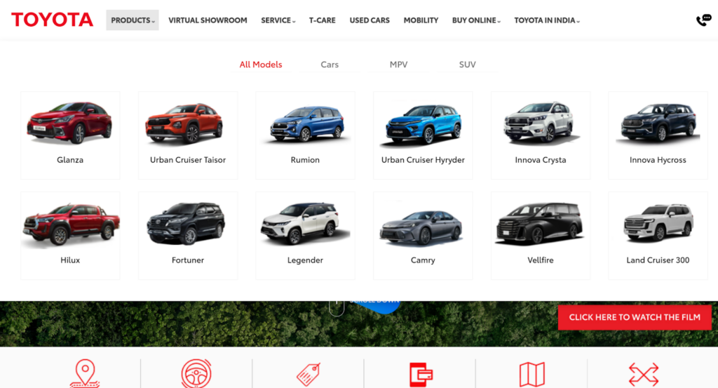
Mega menus are another subcategory of multilevel menus that are usually built with custom HTML blocks. It is preferred as it reduces the amount of scrolling for the users and makes navigation much easier.
Mega menus are often designed to be visually appealing, offering plenty of space to display various elements. One key benefit is that they allow users to preview a section simply by hovering over it, so there’s no need to click to expand the menu. Within these sections, users can easily preview a range of content, such as product categories, subcategories, and more.
Benefits of having an accessible navigation (menu)
Earlier, we have talked about what a menu is and some common types of menus we see on a daily basis on websites and apps. However, what benefits does implementing an accessible menu offer to a business and its return on investment (ROI)? Let’s discuss.
1. An accessible menu leads to a better user experience
According to a report from Hubspot, 38% of people will stop engaging with a website if the navigation is not easy, whereas as per Interaction Design Foundation, a good UX can bring 83% of ROI. In short, having clear and visible navigation boosts the experience of your users. If they’re not able to navigate over your product with ease, that frustration leads to drop-offs.
2. A structured menu design helps improve the SEO
A well-designed navigation menu and related sitemap improve user experience and play a significant role in improving your website’s SEO. Search engines use web crawlers to explore and index your site’s content.
When your navigation is well-structured, it helps crawlers understand your site’s hierarchy and relationships between pages, which contributes to better rankings.
- A structured menu design ensures all important pages are easily discoverable by users and search engines. This helps search engines understand the structure of your site, improving how your pages are indexed.
- Menus naturally include internal links to key pages. These links distribute link equity (ranking power) across your website, signalling to search engines which pages are the most important.
- A well-organised menu makes sure that all pages, including subcategories and hidden sections, are accessible to crawlers, reducing the chances of orphan pages (pages with no links leading to them).
3. A good menu design improves user engagement
If navigation is clear and easy to use, users will find it more convenient to complete their journey over the platform. This encourages them to engage with the content and explore more information on the website while increasing the site sessions, reducing bounce rates, and ultimately boosting conversions. It is important for brands, especially e-commerce platforms, that rely on user engagement.
4. It helps improve brand credibility
A good menu design that makes navigation easier for the users ultimately enhances a brand’s credibility by demonstrating professionalism and a user-centric approach.
When a brand prioritises seamless navigation, it reflects its commitment to providing a positive user experience, which in turn leads to increased engagement and traffic to the product.
5. A menu that helps users navigate with ease increases conversions
Conversions refer to turning website visitors into users, which happens when they find something valuable in your product. First-time visitors are more likely to sign up or complete their journey when the navigation is clear and easy to follow.
Visitors to your website are simply trying to meet their goal or complete a task, which could be exploring a product or making a purchase. A well-designed menu helps guide them effectively, leading to these conversions.
10 menu design guidelines that you need to start following for a better user experience
Now that you understand the importance of clear navigation and good menu design for your product and business, it’s time to take the next step. What are the key menu design checklists you should follow? Don’t worry; we are going to cover all of it in this section.
1. Design a menu that is visible and not hidden from the users
If users can’t find a way to navigate your site, they may leave, leading to drop-offs. A drop-off on a website refers to the point where a visitor leaves a specific webpage without completing a desired action. This happens when the design isn’t intuitive, or the menu is hard to find.
To prevent this, ensure your menus are visible and easy to use. A top navigation bar, multilevel menu, or mega menu are great options. These should be visible as soon as users land on the site, helping them navigate effortlessly and reducing the chance of drop-offs.
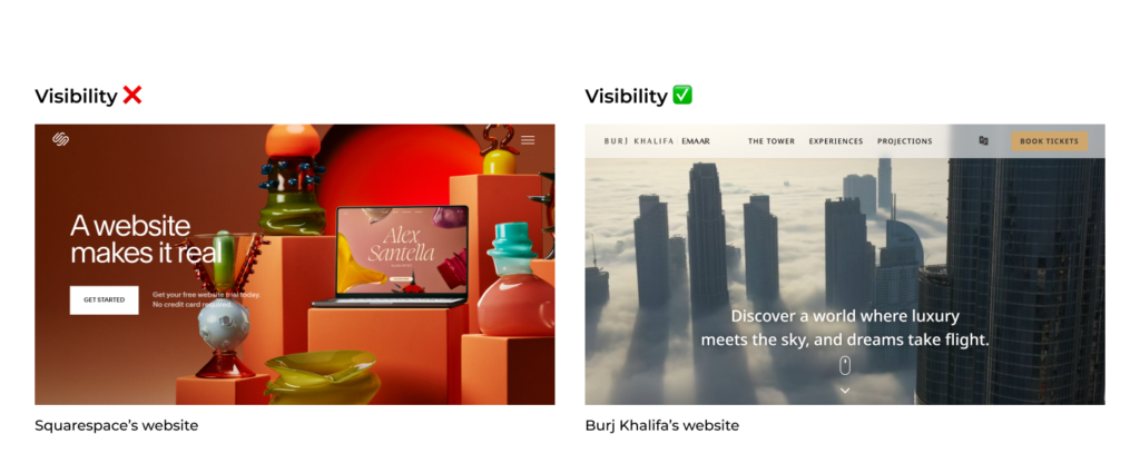
Left view- Squarespace’s website; Right view- Burj Khalifa’s website.
An invisible menu is not only hard to navigate but also increases the touch points within a user flow.
2. A well-structured menu reduces the cognitive load of the users
Cognitive load is the mental effort required to process information. Visibility matters, but it doesn’t mean putting everything in the faces of your users; this leads to cognitive overload.
A common menu design tip is to limit the number of items in the list to a maximum of seven, but according to NN Group, this is actually a misconception. Users aren’t required to memorise the menu content, so there’s no strict need to follow this seven-item rule.
Instead, e-commerce websites often focus on prioritising information and reducing cognitive load by using subcategories and multilevel menus. This approach helps organise content in a way that makes it easier for users to navigate large amounts of information without feeling overwhelmed. By structuring the menu into multiple levels, users can find what they’re looking for quickly, without having to process too much information at once.
3. Use familiar icons and labels for your menus
There are several methods to ensure user-centric design, and one of them is the 10 heuristics of usability by Jakob Nielsen.
Imagine opening a website, and the menu is immediately visible, but you feel confused because unfamiliar icons and labels are used to represent certain actions. In that confusion, you might exit the website before even taking any action. This highlights the importance of using icons and labels that are familiar to the general public. By doing so, users can easily understand what actions to take without needing assistance, allowing them to complete their journey smoothly.
Therefore it’s important that we use icons and labels that the general public is familiar with. This helps them take a certain action with anyone’s help and complete their journey.

Ensure you’re designing your menu keeping this in mind.
4. Optimising menus for mobile screens helps enhancing the user experience
In Q2 of 2024, 96.2% of global internet users accessed the web through mobile phones. As a designer, this means it’s essential to create mobile-friendly designs, considering that most users are browsing on smaller screens.
When designing a mobile-friendly menu, you need to ensure you’re keeping the content accessible and responsive. A bento menu or burger menu might be used for mobile websites. When it comes to native apps, whether on Android or iOS, they have guidelines that one can refer to when designing menus.
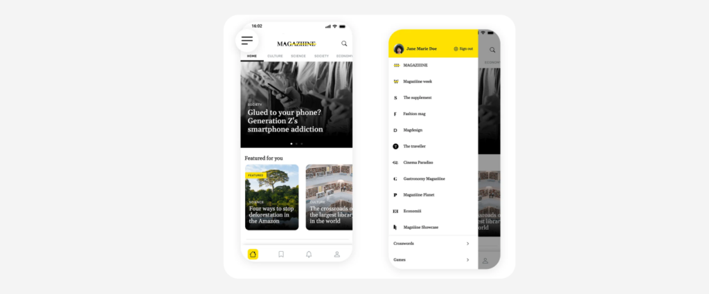
A dummy app using both burger and bottom menu. Source: Justinmind
5. Follow store guidelines for an accessible menu design
When designing for Android, refer to the Material Design guidelines, and for iOS, follow the Apple Human Interface Guidelines. For website design, use the Web Content Accessibility Guidelines (WCAG) as a reference. These guidelines provide essential advice on design, labelling, accessibility, structure, and development.
While these are not strict rules, they are a strong starting point to make sure your design aligns with platform requirements.
6. Create accessible and inclusive designs for your audiences
A design is appreciated when it’s not only accessible but also inclusive. According to the World Health Organization (WHO), 16% of the world population has some sort of disability. As a UX designer, it’s our duty to include this portion of the population while designing.
Accessible design means individuals with different capabilities are able to use digital products. Whereas inclusive design means, it considers all forms of human diversity.
When it comes to menu design, you can ensure this by doing the following:
- Use simple language while labelling your items on the menu.
- Use high-contrast colours and scalable fonts for readability.
- Include icons for faster recognition of menu items.
- If you’re using a search bar, include the voice command feature.
- Keep consistent navigation, if your navbar is at the top, keep it at the top on every page.
- Conduct user testing among people with disabilities.
7. Conduct user testing to check the usability of your menus
In the previous point, we discussed having an accessible and inclusive menu, and for that, one needs to understand their audience. What comes next is conducting user testing. It’s always important to test a new design feature in a monitored environment among your target audience.
It can be challenging to find the right candidates for user testing, especially in an untapped market. If you’re looking for a remote user testing and research platform for the MENA (Middle East and North Africa) region, UserQ can help you hire participants with ease and conduct user testing.
8. Keep your design and content consistent
People tend not to trust platforms that are not consistent; leading to a poor experience. It shouldn’t feel like they’re on a completely new website as they navigate through it. While designing the menu, maintain consistency across all the web pages and platforms. Follow your brand guidelines to remain consistent. A few suggestions would be:
- If a menu is placed at the top, it shall remain there throughout the journey of the user.
- Follow one type of menu design throughout your website and not different variations of it.
- Ensure the language used for labelling terms is consistent throughout the website.
9. Prioritise localisation
Sometimes brands are not able to communicate with potential users because they didn’t prioritise localisation. Localisation is the process of adapting the product’s user experience to meet the preferences of users in a specific country. It has an impact on how well someone may feel comfortable using a digital product. This, without a doubt, goes to designing your menu as well.
If you’re designing a menu interface for a UAE-based product without understanding how digital interfaces work in the UAE, your design might confuse users, causing them to leave the platform. To avoid this, ensure that the menus are designed with the local audience in mind.
Bonus tip: If you are designing for a country in the Middle East, apps and websites also get designed in RTL (Right to Left) format to ensure localisation. So make sure you are doing your research well and designing while keeping localisation in mind.
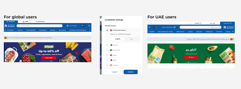
As one can notice on Carrefour AE, if changes are made to the localisation settings, the design and the content help resonate with the local audience by using local Arabic language and using a recognised design pattern i.e. RTL (Right to Left).
10. Conduct regular audits
All your hard work goes in vain if you don’t conduct regular audits of these designs. Audits ensure that menu designs are practical and user-friendly and follow all the menu design checklists that need to be followed.
Conclusion
Designing menus involves understanding the users, applying various principles, and conducting regular audits. These are the 10 menu design checklists that can help you identify areas of improvement in your design.
What’s one guideline that you follow while designing your menus? Let us know down in the comments and keep learning with our articles.
Related Post

10 Warning signs of a
User experience (UX) design is critical in shaping the end-user’s interaction with digital solutions. As it plays a vital role
Potential of AI in UX
With companies prioritising user-centric design to satisfy customer expectations, the Middle East and North Africa (MENA) area is a fast

Tips to write effective prototype
Success in prototype testing can take many forms. For some, successful testing is when they receive authentic and actionable feedback,
Subscribe to our
product newsletter!
Receive emails about UserQ updates, new features,
offers and latest trends.


