🎁 Free 30-day publishing fees on Pay-As-You-GO. Get 15% off when recruiting from the UserQ Panel, with code HELLO15
Research, User experience, UX research
Simplifying information architecture: fundamental principles & testing tips

Information architecture (IA) is a complex concept, and implementing it for the first time can be a bit overwhelming. The complexity of information architecture UX comes from its multiple rounds of research, testing, and iteration until everything is right.
Fortunately, all UX designers now have access to key principles and testing methods to ensure that every piece of information is logical and accessible.
Given the diversity of content categories and media elements in a website or application, knowing how to implement information architecture in UX is crucial to delivering a seamless user experience.
Understanding information architecture (IA)
Information architecture is the science of structuring content and classifying it clearly and understandably, given a specific context and audience. The content is arranged to create a natural flow between the pieces of information shared, allowing those who are consuming this information to find what they need with minimal cognitive effort.
Information architecture inherently exists, even if no one ever designs it. In other words, every website has some form of organisation, whether well-planned or haphazard. But, working to build a good IA is a smart choice, which ensures the content you find is easy to find, understand, and navigate.
Here’s an information architecture in UX example: between a grocery store with a clear layout and one with products scattered randomly in aisles, customers’ footprint will be greater in the former store. Similarly, there’s a big difference between a well-structured website or application with a clear hierarchy of information, intuitive navigation, and consistent labelling and one without.
A well-structured grocery shopping application’s main navigation may have categories and subcategories like;
- Dairy >> Milk; Cheese
- Meat >> Poultry; Beef
- Fruits >> Exotic Fruits; Local Fruits
- Vegetables >> Organic Veggies; Green Veggies
Such a structure ensures the customers have a smooth shopping experience and can find everything they need.
Three pillars of information architecture
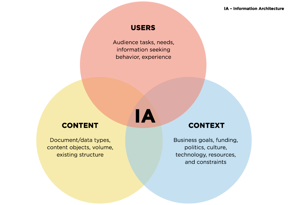
When building an information architecture UX of any digital touchpoint or physical environment, you should consider three pillars;
Context
Context in information architecture in UX represents the environment in which a user engages with the content. It incorporates the purpose for which we need to create an IA. To figure out the context, determine where, when, and how the users interact with the content or product.
Using this information, a professional will be able to more easily determine the boundaries of the information space, including the range of topics and depth of coverage.
Users
Users are the target audience who will receive the content and are at the centre of any digital experience. When working on information architecture UX, you must understand the users’ needs and preferences, including their behaviour and mental models. Considering the users and their preferences you can create intuitive and user-friendly interfaces that align with users’ expectations.
Content
Content includes text, images, videos, and other interactive elements. Considering context and users, you can create content that resonates well with your users and plan the IA that incorporates content logically and hierarchically.
By understanding users and their needs, you can structure content hierarchically and categorize information effectively, ensuring they find the required information quickly and with minimal effort.

Venn diagram depicting information architecture | Source: FiniteWisdom
Fundamental information architecture UX principles

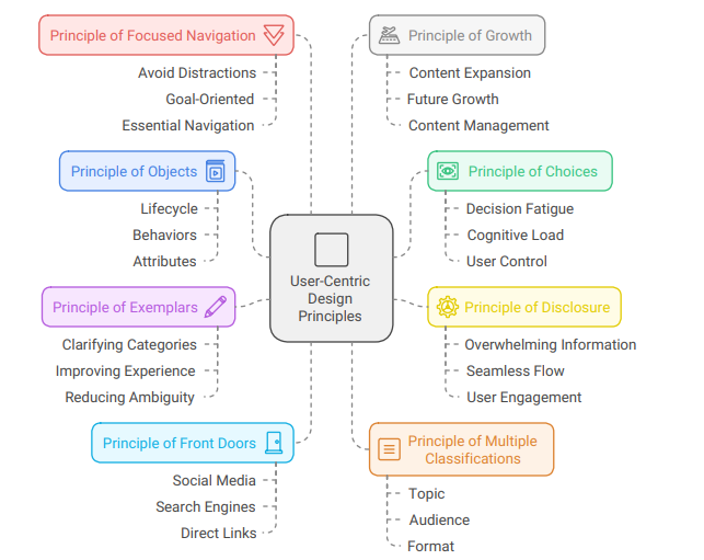
1. Principle of objects
The principle of objects in information architecture UX asks you to consider the content and information you use as a living entity. This entity should be treated as having its own unique lifecycle, behaviours, and attributes. By considering every object as a living entity, you can easily accommodate changes in the future and stay aligned with the user’s expectations.
When you consider every object as a living entity, it’s easier to understand the content type, its intended usage, and how it interacts with users over time.
Structuring the content taking into consideration this IA UX principle means every piece will serve a specific purpose, which assists with its usability and consistency. Through this, it’s easier to maintain scalability because content evolves, which makes updating or repurposing it as and when required.
2. Principle of choices
Don’t confuse your users with too many options. Let them take control of where and how to navigate the website or application. The principle of choices when applied to information architecture in UX propagates that you offer a limited number of clear and distinct options at each navigation level.
By curating choices for your users, designers can eliminate decision fatigue and reduce the cognitive load on users. Where too many options can increase cognitive load, too few will frustrate users by limiting their options. So, a user-centred design should have clearly distinguished choices, allowing users to navigate intuitively and improve usability.
3. Principle of disclosure
Present only enough information at every stage to make it easier for your users. This ensures that your users don’t anticipate content at the next stage or level unless you want to create some hype or give them a shortcut. This will ensure the users understand their options and decide their next step. Sharing more than enough information will make things overwhelming for your users, which increases frustration, and they may decide to leave.
They may leave because users will have to search for the information they need, which requires them to explore deeper layers of content. Applying this principle, it’ll be easier to create a seamless flow of information and ensure your users get all the relevant details quickly while keeping them engaged.
4. Principle of exemplars
Another way to improve intuitiveness and create user-centric design is to clarify categories and options with a navigation system. The design you create, or the information you share shall have representative items from each category. The purpose of using this information architecture (IA) principle is to ensure your users find the information they need quickly.
Using exemplars can simplify decision-making and improve user experience. Moreover, following this information architecture in UX principle can effectively reduce ambiguity and increase familiarity with the product. When designers include products or articles under a separate category, the purpose is clarified, and engagement increases.
5. Principle of front doors
With regards to IA for UX, the principle of front doors propagates an idea that you should build multiple access points to a website or application. In addition to having multiple doors, also ensure that the users can find the information they need as quickly as possible regardless of from where they enter.
Hence, design every page like a front door, welcoming users and guiding them to the relevant page or information without them needing any prior context or taking too much time. With this information architecture UX principle, you have to consider multiple entry points to your website, like social media, search engines, direct links, etc.
6. Principle of multiple classifications
Following this IA for UX principle, designers must organise content to accommodate different user preferences, perspectives, and mental models. Every user searches for information in a different way. Hence, this principle supports multiple navigation paths, like by topic, by format, by category, etc., but ends with the user reaching the same content he was looking for.
With various paths to choose from, users can select the ones that best align with their mental model and help them complete their tasks efficiently. This gives users a sense of control over how they interact with a website or use a product.
7. Principle of focused navigation
This information architecture UX principle asks designers and developers not to group items and content together if they are not related or have nothing in common. This means avoiding adding distractions, redundant links, or unrelated items in a focused navigation path to simplify the user journey.
When items and objects are placed together and have little in common, the navigation structure is detonated with a proverb, “mixing apples and oranges.” The principle asks to focus on creating essential navigation to create a goal-oriented user experience.
8. Principle of growth
Content in every form is ever-expanding, which means whatever you add today may need to be revised or even relevant soon. Hence, this principle dictates that you build IAs with scalability in mind. Designing IAs while considering content growth, as the content you add today will be a fraction of what will be added in the future.
Hence, a forward-thinking approach should be used to consider the website’s long-term growth while making it easier to create and manage content in the future.
Information architecture in UX testing tips
It’s quite frustrating to see your users unable to find what they are looking for, facing issues, or getting frustrated easily, even when you’ve built the information architecture following taxonomy and categorisation best practices.
To ensure your users don’t encounter findability issues or navigation barriers, which can lead to a bad user experience, you need to test the information architecture (IA) for UX with real task-based scenarios. Here are some tips for a good testing outcome.
- Use standard testing techniques: UX designers often use tree testing and card sorting to resolve issues in the IA.
- Card sorting: Participants are asked to group items into different content categories. They can either create their own categories or select from predefined ones. Card sorting is used early when the IA stage is still not defined. As a result, you can take assistance from your users to build an IA that resonates with the masses.
- Tree testing: Participants are presented with the hierarchical structure of a website or application’s navigation, often displayed as a simple outline. The users are then given tasks to find specific information within the structure. This test aims to identify navigation issues and determine which features are leading people astray.
- Recruit relevant testing audience: It’s important you find the right participants to test IA for UX examples. Since your user base will be diverse, search for the right participants in different places, including your community and online user panels.
- Test quickly, early in the process, and do it often: When you test early, it’s easier to make changes in information architecture UX early as opposed to making changes after a customer complaints or shares a negative feedback.
Changing the app’s design, features, etc. after negative feedback means you will have to dedicate additional hours and resources to fix the issue.
Conclusion
Information architecture in UX provides a solid foundation for a product, ensuring that whatever you build aligns with the end-users. By using information architecture UX best practices and following the eight IA UX principles, you can improve the usability and navigation of your design.
More importantly, it will help build a scalable and flexible design that you can change today and in the future to provide a positive user experience. With UserQ, you can conduct card sorting and tree testing to validate design decisions and recruit participants from our MENA-based panel. With our help, building functional and user-centric designs will be easier.
Related Post

The benefits of user research
User research is typically a key part of product development and business growth all around the world, but here at

Best practices for conducting remote
In this guide, we’ll let you in on UserQ’s top tips and tricks to utilise our selection of remote user

Start, Grow, Lead: A Guide
A career in which you can make a real difference to the everyday lives of customers and clients alike is
Subscribe to our
product newsletter!
Receive emails about UserQ updates, new features,
offers and latest trends.


