🎁 Free 30-day publishing fees on Pay-As-You-GO. Get 15% off when recruiting from the UserQ Panel, with code HELLO15
Testing figma prototypes like a pro: get actionable user insights

When designing a product, creating a great user experience is crucial. Prototyping tools like Figma make this process much easier, helping teams design and collaborate on interfaces. But how do you ensure your designs are working as intended? This is where testing your Figma prototypes comes in. By conducting user testing on your Figma prototypes, you can gather valuable insights that help improve the overall user experience.
In this article, we’ll guide you through the process of testing Figma prototypes like a pro. We’ll cover how to prototype with Figma, how to conduct user testing, and provide useful Figma prototype tips to help you get the most out of your tests.
Why test figma prototypes?
Testing Figma prototypes is essential because Figma is the most used tool among designers, and now most of the testing tools available have this integration with Figma for this reason. It also helps you validate your ideas and identify potential usability issues. According to the UX Collective, 50% of development time is saved when prototyping is integrated into the design process before full development starts. Here are some key reasons why you should prioritise testing your Figma prototypes:
- Get user feedback early: Testing allows you to gather feedback from users before your product goes live. By picking it up early in the design process, you save time and money, not having to find solutions later on.
- Improve usability: User testing can help you discover your pain points and where you’re confusing people. These addresses can make your user experience more user-friendly.
- Ensure functionality: User testing validates that your prototype functions as intended for both your needs and the users’
- Refine design decisions: User testing can help you see how your design choices need to be improved and make decisions based on the results in the future.
A survey showed that 92% of teams using Figma for collaborative design believe it significantly improves the speed of the design process. The next awesome step would be to collaborate on prototyping well with Figma and conducting user testing to get actionable insights.
How to prototype with figma
You can’t test your designs until you create a working prototype. With Figma you can prototype static designs in the form of interactive, clickable ones for users to explore.
Here’s a step-by-step guide to creating a prototype in Figma:

1. Set up your design
The first thing to do is to design the UI elements on Figma. In Figma, you can use their magical tools to wireframe your app or website. Ensure your design covers all relevant pages and flows to your research/testing objectives to ensure that it does not create dead ends when testers browse. The more complete your design is, the more accurate your testing results will be.

2. Connect your frames
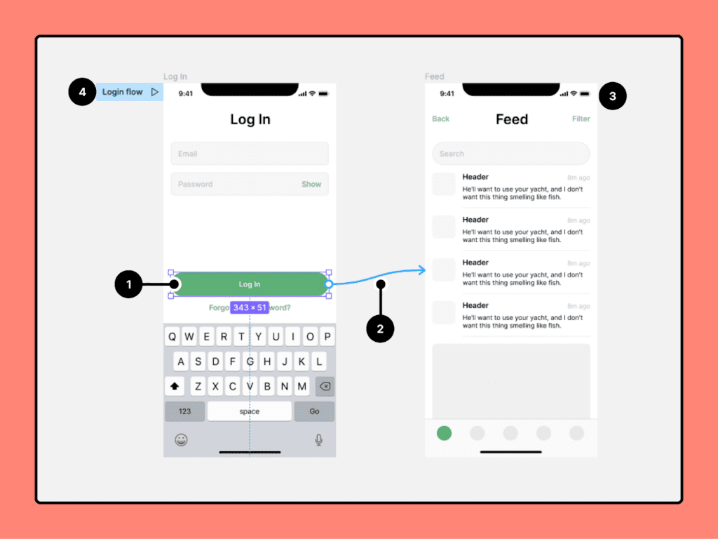
Once your design is ready, it’s time to add interactivity. In Figma, each screen is represented by a “frame.” To prototype, you need to connect these frames so that users can navigate between them. Here’s how:
- Select the element you want to make interactive (e.g., a button or link).
- Click on the “Prototype” tab in the right-hand sidebar.
- Drag the blue arrow from the selected element to the destination frame.
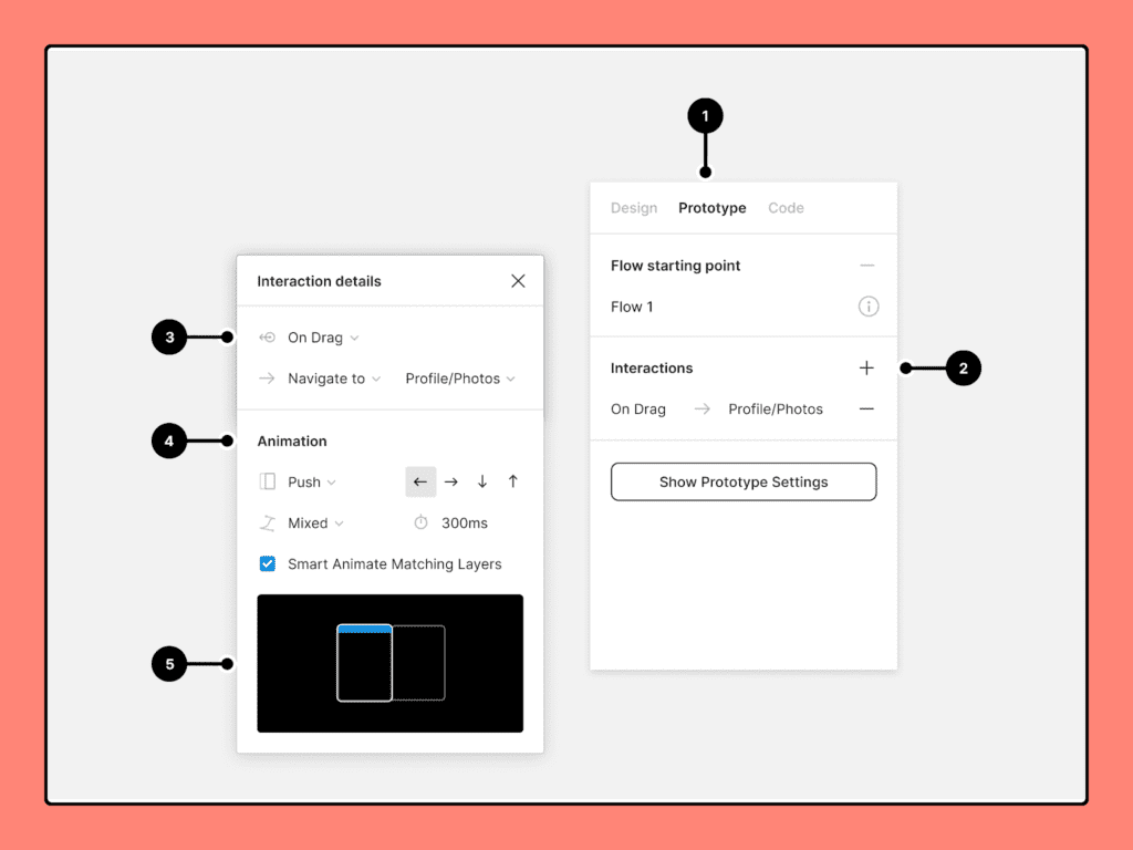
- Choose how the interaction will work (e.g., “On Click,” “On Hover”) and select a transition (e.g., “Instant,” “Slide,” “Fade”).
By linking your frames and setting interactions, you create a clickable prototype that simulates the final product’s functionality.

3. Add animation and transitions
To make your prototype feel more realistic, consider adding animations and transitions between different screens. Figma allows you to create smooth transitions, such as sliding from one frame to another or fading in elements.
For example:
- If a user clicks a button to move from one screen to another, you can add a sliding animation to mimic the natural flow of a mobile app or web page.
- You can also animate elements on the page (e.g., loading spinners and expanding menus) to give your prototype a polished feel.
4. Share the prototype
Once your Figma prototype is complete, you can share it with others for feedback and testing. Figma allows you to generate a shareable link to your prototype, which can be accessed by anyone with the link. You can also control the permissions, allowing others to view, comment, or edit the prototype.
Now that your Figma prototype is ready, it’s time to conduct user testing.
How to conduct figma user testing
Conducting user testing in Figma helps you validate your designs and collect valuable feedback directly from your target audience. UX insights gathered from user testing can improve conversion rates by up to 400% when applied to e-commerce and website design. Here’s how to carry out effective user testing for your Figma prototypes:
1. Define your goals
Before jumping into user testing, define clear goals for what you want to achieve. Are you testing the usability of your navigation? Do you want to see if users understand a new feature? By setting specific goals, you can focus on the most important aspects of your design during testing.
2. Create tasks for users
To gather actionable insights, create specific tasks for users to complete during the test. These tasks should reflect real-life scenarios they might encounter while using your product. For example:
- “Find and sign up for a free trial.”
- “Navigate to the product page and add an item to your cart.”
- “Complete the checkout process.”
By assigning users tasks, you can observe how they interact with your prototype and identify any pain points or confusion.
3. Recruit testers
The next step is finding people to test your Figma prototype. Ideally, these testers should be representative of your target audience. User-centric design (including prototyping and testing) reduces product development costs by up to 50%You can recruit testers from various sources, such as:
- User research platforms: Platforms like UserQ allow you to find and recruit users for testing.
- Existing customers: If you already have customers, invite them to participate in the testing process.
Social media: Reach out to your social media followers or online communities that align with your product’s audience.
4. Observe and record feedback
During the test, observe how users interact with your Figma prototype. Take notes on any challenges they face, such as confusing navigation, unclear buttons, or broken links. It’s also helpful to ask users to think out loud as they complete tasks. This will give you insight into their thought process and why they’re making certain choices.
You can conduct tests remotely by sharing the Figma prototype link and having users complete tasks while recording their screens. Tools like UserQ or Maze offer features allowing you to observe users interacting with your prototype.
5. Gather actionable insights
Once the testing session is over, analyze the results. Look for patterns in user behavior and identify any areas where users struggled. Here are some key things to focus on:
- Usability issues: Were there any areas where users consistently struggled? For instance, if that key feature that everyone thought they needed didn’t exist or they just got stuck on a certain screen?
- User satisfaction: Were users comfortable finishing tasks, or were they frustrated? Did they have any particular features they liked or didn’t like about them?
- Opportunities for improvement: After which, you can gather the feedback and then identify new opportunities to make the user experience smoother and refine your design based on the new feedback.
Now that you’ve gathered feedback from user testing, it’s time to make improvements to your Figma prototype.
Figma prototype tips for better testing
To get the most out of your Figma prototype, here are some tips to keep in mind:
Keep it simple
When working on your Figma prototype, make sure to keep only your core functionality in the prototype to be tested. Don’t add unnecessary details or complex interactions into your prototype. A simple streamlined prototype will allow testers to focus on doing key tasks and provide them valuable feedback.
Use real content
Instead of using placeholder text like “Lorem Ipsum,” try to use real content in your prototype. This will give testers a more accurate sense of how the final product will feel and help you get more meaningful feedback.
Test different devices
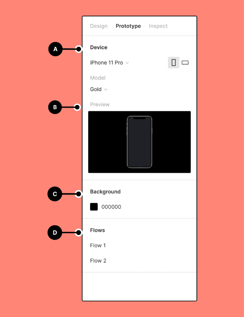
If your product will be used on different devices (e.g., mobile, tablet, desktop), make sure to test your Figma prototype on all relevant platforms. Figma allows you to preview prototypes on different screen sizes, so take advantage of this feature to ensure a consistent experience across devices.
Test in multiple stages
Don’t wait until the final stages of your design to conduct user testing. Testing at various stages of the design process—whether you’re working with low-fidelity wireframes or high-fidelity mockups—can help you catch issues early on and avoid costly changes later.
Iterate and improve
User testing is an iterative process. After gathering feedback, make improvements to your prototype and test again. Each round of testing will bring you closer to a polished, user-friendly design. Iterative design (involving repeated cycles of prototyping and user testing) can reduce time to market by 30-50% as teams identify and fix issues early.
Conclusion
Testing Figma prototypes is a powerful way to gather actionable user insights and ensure your designs meet user needs before launching the product. By following the steps outlined in this article, you can prototype with Figma, conduct user testing, and apply Figma prototype tips to improve your design process. Remember, the key to successful testing is setting clear goals, observing user behavior, and continuously iterating based on feedback. With Figma’s robust prototyping features and the right testing approach, you’ll be well on your way to creating designs that delight users.
Related Post

The benefits of user research
User research is typically a key part of product development and business growth all around the world, but here at

Best practices for conducting remote
In this guide, we’ll let you in on UserQ’s top tips and tricks to utilise our selection of remote user

Start, Grow, Lead: A Guide
A career in which you can make a real difference to the everyday lives of customers and clients alike is
Subscribe to our
product newsletter!
Receive emails about UserQ updates, new features,
offers and latest trends.


