Micro-UX Macro Impact Tiny Design Fixes That Changed Everything

A small stone thrown in still water is capable of creating multi-directional ripples. Despite its small size, the stone’s impact on the water’s calm surface changes the entire dynamics of the water body. Similarly, small or micro UX tweaks can have a significant impact on a product’s usability, user acceptance, and business outcomes.

We have all heard about the $300 million button, right? A tiny UX fix that skyrocketed an e-commerce business’s sales to $15 million in the first month and a whopping $300 million in the first year after making that change. 

This article takes you through similar jaw-dropping and inspiring examples of how small UX improvements changed the fortunes of those businesses and redefined how they engaged with their users. 

Micro UX changes that paid off for different businesses

Every business is chasing that Eureka moment, and these micro UX fixes consciously or subconsciously turned out to reshape their growth trajectory. 

Let’s explore some real-life examples.


1. Amazon’s 1-Click checkout

Although Amazon’s infamous 1-Click patent expired in 2017, it was one of the biggest talking points in the e-commerce world, particularly in 1997, when it filed for it. The online shopping cart abandonment rate is around 70.2%, and Amazon’s 1-Click checkout was introduced to eliminate a major friction point during online shopping: the checkout process. 

The 1-Click checkout feature allowed customers with saved payment and shipping information to make purchases in just a single click, making the entire checkout process as frictionless as possible. 

Amazon’s revenue surpassed $48 billion in 2011, and even if we assume that the 1-Click increased its sales by 5% annually, that’s a $2.4 billion per year increase only because of the micro UX change, 1-Click. 

Although Amazon never released any data on the impact of 1-Click on the business, the tiny UX tweak will certainly go down as a game-changing event in the e-commerce industry. 


2. Airbnb – from blurry photos to a global empire

Airbnb app

 Image source: Image by Peggy from Pixabay

Airbnb clocked a revenue of $11.10 billion in 2024, but do you know the company was almost bankrupt circa 2009? It is safe to say that Airbnb was dying a slow death before they changed something and harnessed the power of UX research and design to reshape their future. 

After visiting some of their hosts, the founders, Brian Chesky and Joe Gebbia, quickly realized the problem: blurry, dull, dark, and low-quality images of listings. The next step? Instead of redesigning their website, the team invested in clicking high-quality photos of all the listed apartments and uploaded them. 

The result? The bookings doubled, and today, Airbnb has more than 5 million global hosts on its platform. This example highlights the importance of applying the principles of design thinking to build user trust and how minor UX improvements can impact business growth. 


3. Google’s 41 shades of blue test

The biggest companies in the world leave no stone unturned to achieve greatness, and Google’s 41 shades of blue test is a testament to that. This is what Google did in 2009. One of their designers picked the most preferred shade of blue in the team to design the toolbar. When a product manager ran an A/B test to compare the clicks on the chosen blue’ and a different blue with a greener shade, she found that users were more likely to click on the greener shade of blue. 

Then, she asked the design team to test 41 shades of blue between the two blues to determine whether different hues of blue get different clicks. After completing forty experiments, Google found that a purpler shade of blue received the maximum clicks, resulting in a $200 million annual ad revenue for Google.  

This data-first, user-centered design thinking system and level of attention to detail highlight how even the smallest changes can play a significant role in improving user engagement and performance. 


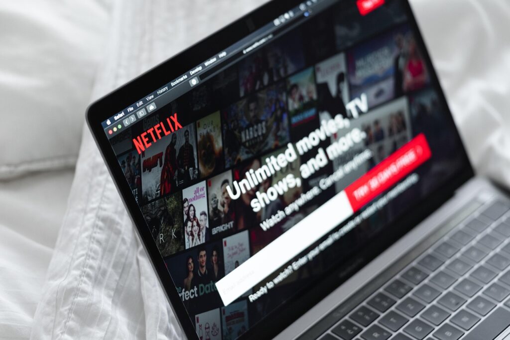
4. Personalized thumbnails by Netflix

Netflix thumbnails

Source: Image by yousafbhutta from Pixabay

With over 300 million paid memberships spread across 190 countries, Netflix is arguably one of the largest entertainment services in the world. The company’s success can be attributed to a range of factors, including engaging video content, adaptive streaming technology, data-driven personalization, and a neat and clean UX. 

One UX improvement Netflix made that stands out is personalized thumbnails. 

Netflix’s personalized thumbnails for movies, documentaries, and web series were a game-changer, leading to increased user engagement. Netflix not only uses AI-driven machine learning algorithms to pick recommendations for users based on their viewing history, but it also customizes thumbnail creatives for every title to capture a user’s attention and minimize decision fatigue. 

The tailored thumbnails align with some of the core principles of UX, such as reducing friction and providing a flawless product experience. This micro UX tweak increased Netflix’s click-through-rate (CTR) by 20%, highlighting the importance of optimizing user interactions to boost engagement.

Parting notes

These examples teach us how small UX improvements can drive meaningful business outcomes. While these UX tweaks changed the fortunes of these businesses, they also serve as a timely reminder of how even the smallest design decisions can improve a product’s success. 

Leave a Comment

Subscribe to our
product newsletter!

Receive emails about UserQ updates, new features,
offers and latest trends.

    Footer Logo Transparent

    Say goodbye to assumptions in product research and get real feedback from local users with the first user research platform in MENA.

    PRICING

    TESTERS RECRUITMENT

    RESOURCES

    TESTERS

    LANGUAGE

    RESEARCHERS

    Copyright © 2025 UserQ – A Digital of Things company

    I’m a researcher

    I want to use UserQ to publish tests and get results

    I’m a tester

    I want to use UserQ to take tests and get paid